Short answer, yes.
I know that’s the last thing an author wants to hear, since the story is what matters.
You’re right, the story does matter.
But I want to make something clear – readers have many choices, many books they have not yet read, and they are constantly inundated from all directions. As readers, we are trained to find what we need in the best way we can, and sometimes that means scrolling down Amazon, for example, and briefly surveying our options, and guess what – your book cover is the first thing we see.
Other than your book’s cover being the first impression you give people, I have some other reasons why we should always be mindful of the book cover. And that’s not just because I’m a book cover designer, but mostly because I have seen these mistakes happen again and again.
I don’t want you to make those mistakes.
I want your book to be read.
So without further ado, these are all the reasons WHY you should assume that readers will always judge your book by its cover, and why you should use that fact to help your book sell more copies and gather a bigger readership.
Reason #1: The Power of Good Design
Readers are very well versed in good design. They might not have gone to Art School or know the rules of design, but they can immediately tell a good design from a bad one, and when given the choice, they will choose a design that is pleasing to the eye.
I know when I scroll down Amazon, my hand stops when something pretty catches my eye, and that’s not necessarily a bad or shameful thing. It’s a fact – humans are visual creatures and the sooner we embrace it, the sooner we can use it to our advantage. Right?
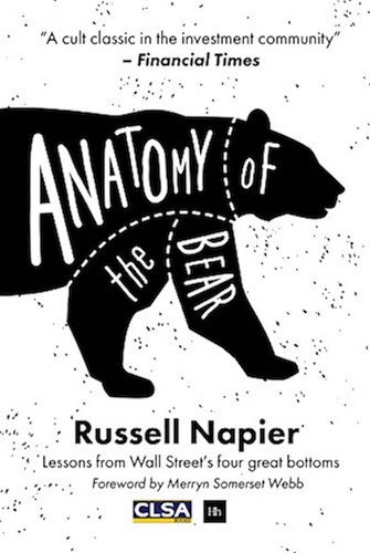
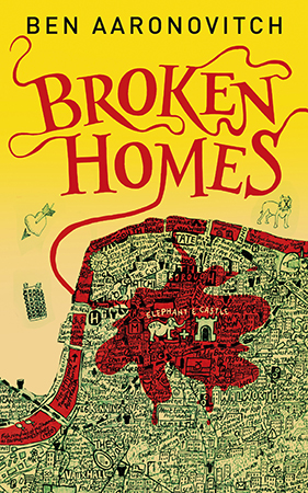
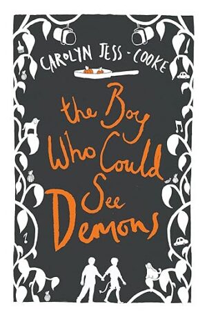
Here are examples of good design:
Reason #2: Design Must Fit the Genre
This is one of the biggest mistakes rookie designers and rookie authors can make, and I’ve seen it time and time again. Basically, you create a book cover that fits perfectly with your story, the way you see it, all the symbology, etc, but it doesn’t fit the genre.
Ooops.
Thing is, when readers are looking for a specific book, they’re usually looking into their favorite genre, or the genre, they’re in the mood for, and if your book cover doesn’t SCREAM your book’s genre, they might move on to books that fit with their expectations. Or worse, they might really like your book cover, purchase the book, and then suddenly, realize they’re reading something in a different genre, something that they didn’t expect, and they are pissed. Now you have an unhappy reader at your hands and a one-star review, when all you wanted was a happy reader.
To make readers happy, you have to meet their expectations. It’s just the way it is in the industry and the world of reading. If your package does not correspond to what’s inside the package, nobody will be happy to find the surprise they did most definitely not pay for.
Let’s take a look at some examples of book covers that fit their genre:
If I asked you which is romance, which is fantasy, and which is thriller, I bet you would give a 100% right answer. It’s not just the picture that are used either, it’s the fonts, the mood, and so many other things that we know subconsciously because we see book covers every day. It’s ingrained.
So give your readers what they want. Show them that you know what you’re doing. And they will love you for it.
Reason #3: Poor Cover, Poor Sales
In this case, I’m not just talking about bad design or wrong genre. I am talking about everything that could go wrong – poor design, wrong genre, wrong mood, ill-fitting font, setting the wrong expectations, et cetera. Basically, there are a lot of things that could go wrong with your book cover, which are only things a professional designer could tell you about, and when they do, that results in:
Poor sales.
You’ve worked so hard on your book, on making it the best it can be for your readers, so you really want to give it all the shots it deserves to be successful. But if you get lazy at the point that is a reader’s FIRST impression, now that is something you can’t afford.
The book cover is your very first impression on your reader and it has to make them want to read the description, to make them want to buy the book, and this is where you really can influence people. Never skip this step or do a poor job at it because this is truly the part that can make or break a book’s sales. There’s no point in trying to sell something if it’s not 100% ready to be sold. And that means a book cover that: a) attracts the eye and b) fits with the readers’ expectations.
Look, I am all for doing things your way and publishing your book on your own terms. And I do not believe that appearances should be the be all and end all of publishing. However, I do know good design and good marketing go hand in hand, and we do live in the industry that the people before us have created. So until we get to live in that idealistic world where people don’t judge a book by its cover, we have to play by these rules. If we want to sell our books, that is.
Listen to the professionals. Hire a book cover designer.
Make your book the best it can be.
It deserves it. 🙂


